Work / Logo design / 2020
eezeeque
This was a fun project in the mist of the pandemic. The app vision is simple and straightforward, a queue system for small businesses to manage their customers waiting in line. I was responsible for the logo design, user interface design and development. Our main stakeholder had a clear goal in mind but also gave the developers a lot of execution freedom to make fast decisions and iterate quickly.
Logo design
Start with a concept
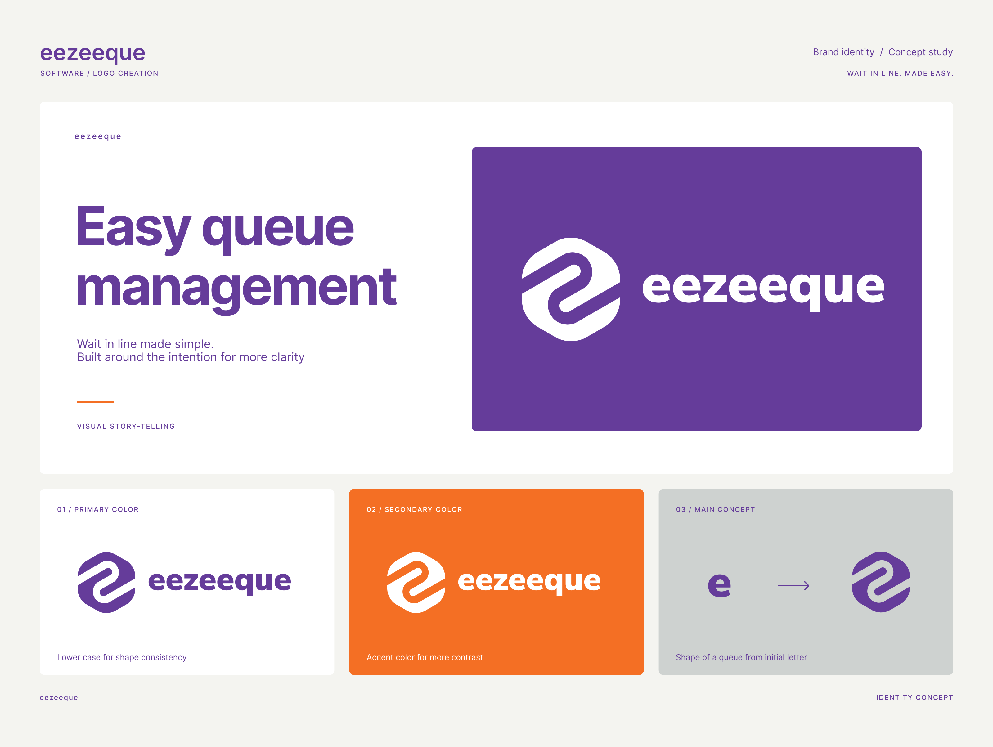
The logo concept started with the first letter of the brand name. Not long after the inital iterations, the shape of the letter "e" was designed to look more like an actual queue. The challenge was blending the logo with the brand name. An all-lowercase design to give every letter equal visual weight was my suggested approach and after explaining the reasoning, the logo was approved.
Purposeful branding. Lasting impression.
A good concept simplifies the design process, it tells a story without words and gets the message across. Easy for stakeholders to agree on when the message is loud and clear.